
DV
Data Visualization
Indexing
Sifting through hundreds of thousands of hours of indexed videos
Data Visualization
Sifting through hundreds of thousands of hours of indexed videos
Data Visualization
Arcmira media summary
Explore podcasts, interviews & explainers on data visualization — 13 indexed from Normal Curves Podcast & MyOnlineTrainingHub, updated Jan 2026.
Methodological moral regarding the misuse of bar charts for numerical data.
The process of creating charts, pivot tables, and dashboards to interpret financial data.
The core theme of the episode: using AI to create interactive dashboards.
create the subscription in the dashboard or by calling the subscriptions API.
The Federal Reserve's graphical representation of individual FOMC members' projections for future interest rates.
Arcmira tracks 13 indexed media appearances or mentions for data visualization, tied to source videos, channels, and transcript-derived context.
Arcmira uses indexed YouTube videos and transcripts. Representative source evidence on this page includes "Bonus: Pheromones with commentary" with transcript-derived context and links when available.
data visualization is connected to Google, AI, OpenAI in Arcmira's media graph.
13
Mentions
65.7K
Views
The trendline is visible, but the dated evidence behind data visualization is in the premium layer.

“Methodological moral regarding the misuse of bar charts for numerical data.”
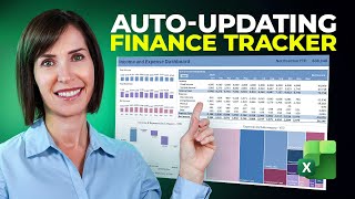
“The process of creating charts, pivot tables, and dashboards to interpret financial data.”

“The core theme of the episode: using AI to create interactive dashboards.”

“create the subscription in the dashboard or by calling the subscriptions API.”

“The Federal Reserve's graphical representation of individual FOMC members' projections for future interest rates.”